A System in Transition: One Experience
Moving the whole Payoneer platform onto the new design system while a two-person team handed the build over to the people who use it. Three migration routes, one workflow, and a contribution model that outlived the project.
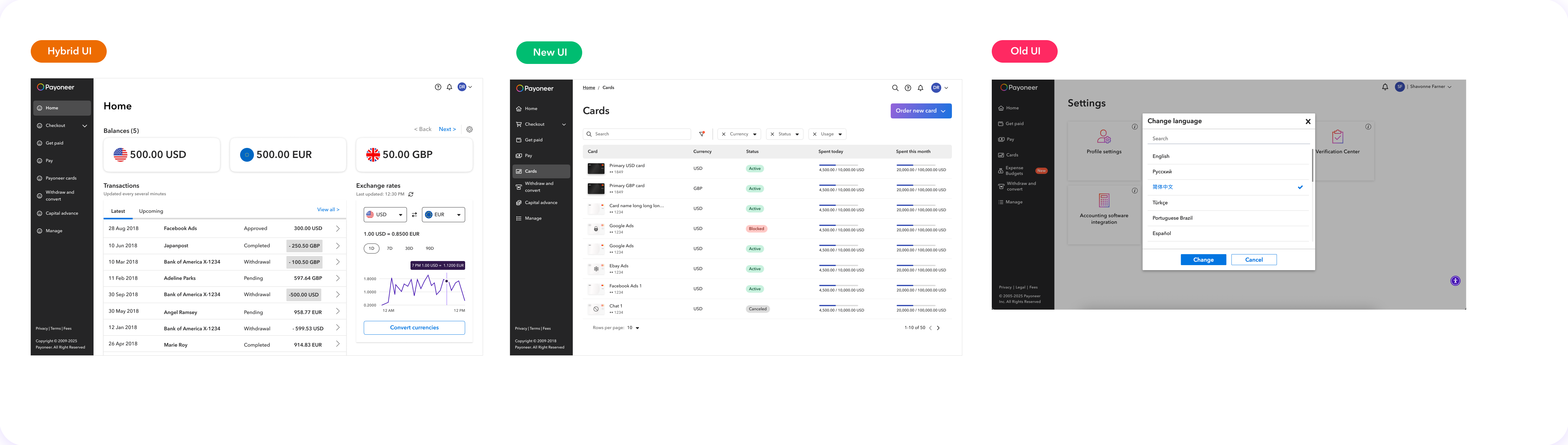
Old design system, new design system and hybrid screens lived side by side. Users could click between two pages and land in what felt like two products.
Use a platform-wide code refactor as the vehicle. Triage every domain into one of three routes by complexity, give each route a written workflow, and move component building into product teams.
A single system across the platform, no route that ships legacy UI, and a contribution model where product teams build components under design system governance.
Inconsistency in a financial product is not a visual flaw. It is a trust problem.
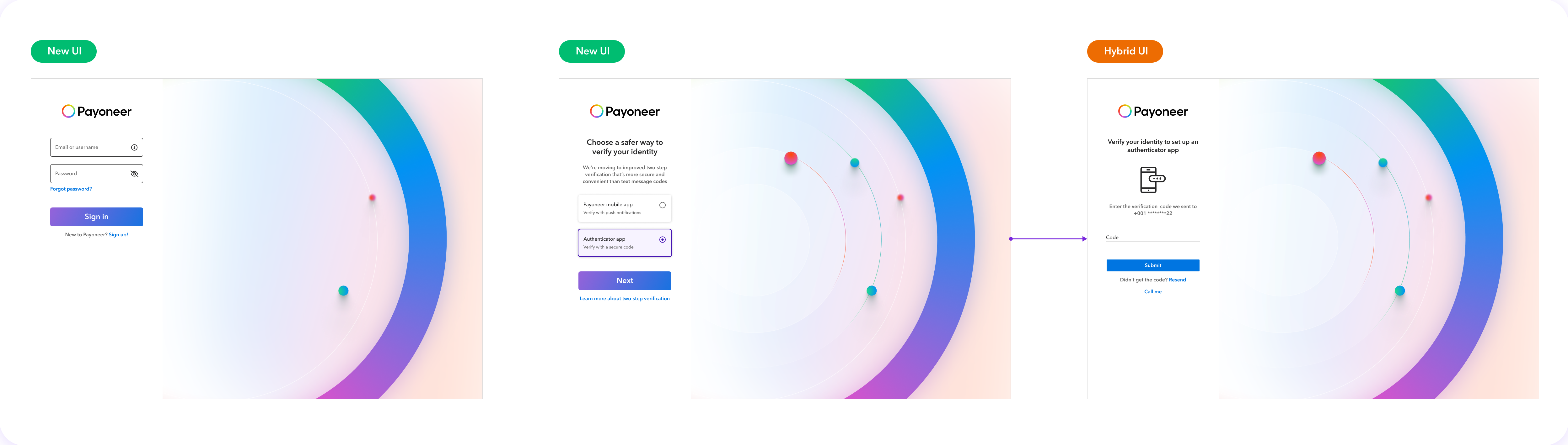
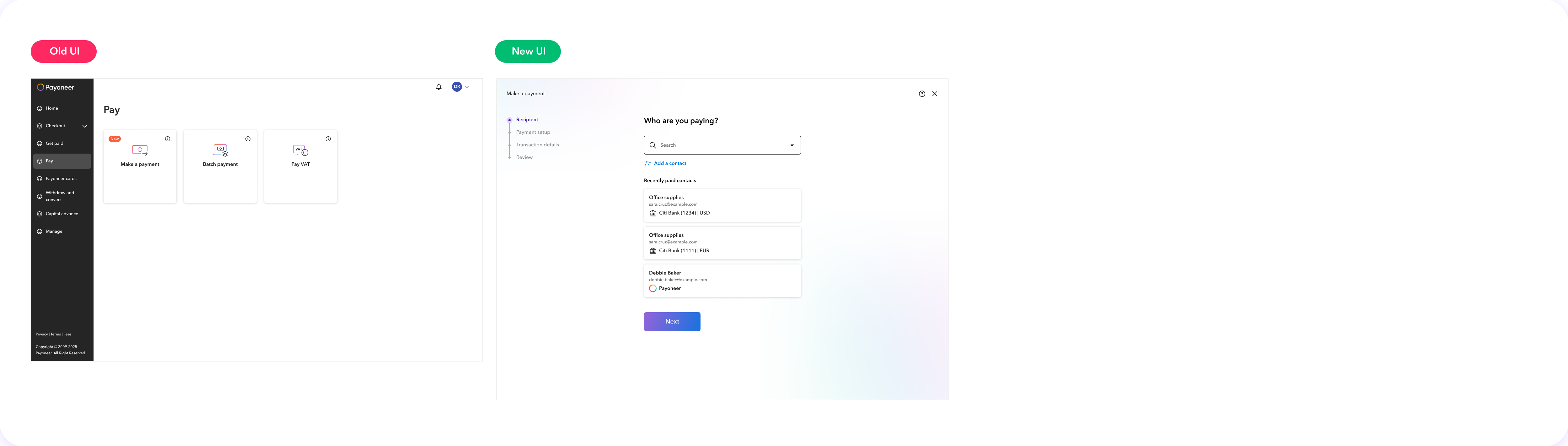
By the time the new design system was ready, the platform had drifted into three states. Some domains had been rebuilt on the new system. Many still ran on the legacy one. And a growing number were hybrids: a new header over an old table, a new side panel opening from a legacy list, two generations of button on the same page.
It was worse than either extreme. A customer moving from their balance to a payment request to verification would meet three different navigation models, three sets of form behaviours and three visual languages within a minute. The UI changed, and so did the experience: where actions lived, how errors read, what a confirmation looked like. For a product that holds people’s money, that unpredictability reads as carelessness.
{{ c.title }}
{{ c.body }}
What a user actually saw
Three everyday journeys, captured as they were when the project started. Each one crosses at least two of the three states within a few clicks.
Engineering had to touch every screen anyway. We made sure design came along.
A migration of this size never gets funded on design consistency alone. The opening came from engineering: the front-end guild decided the platform’s code had to be reworked end to end. Every module would be opened, refactored and re-tested. If the UI was going to be rebuilt in code regardless, rebuilding it on the old components would have been the expensive mistake.
We proposed folding the design system migration into the refactor: one program, one module list, one definition of done that covered both code and UI. That framing turned the design system from a request competing for roadmap time into part of work already committed to.
Not every domain needed the same treatment.
Domains differed in size, age, traffic and how far they had already drifted. One process for all of them would have been either too slow or too shallow.
{{ f.body }}
Triage by complexity, then follow the route to the end.
Every module in the system was reviewed with its domain designer and the guild and assigned one of three routes. The assignment set the scope, the owners and the QA gate, so nobody had to renegotiate what “done” meant module by module.
{{ r.title }}
{{ r.body }}
{{ r.when }}
Why Lift & Shift was dismissed
Lift & Shift existed to protect the schedule: refactor the code, leave the UI untouched, migrate later. In practice it recreated the problem we were solving. A module that kept legacy UI stayed inconsistent with its neighbours, and “later” had no owner. The guild also found that once a module was open, wiring the new components was rarely the costly part. Within the first months we retired the route. Every module now had to ship on the new system, either by replacing components or by redesigning.
A written path for every route, so decisions happened once.
With two designers and dozens of modules, we could not sit in every conversation. The workflow replaced us in the room. It states, for each route, what the domain designer does, when the design system team steps in, what the developer checks, and what happens when a component is missing. Each step carries its owner: UX, DS or DEV.
{{ s.body }}
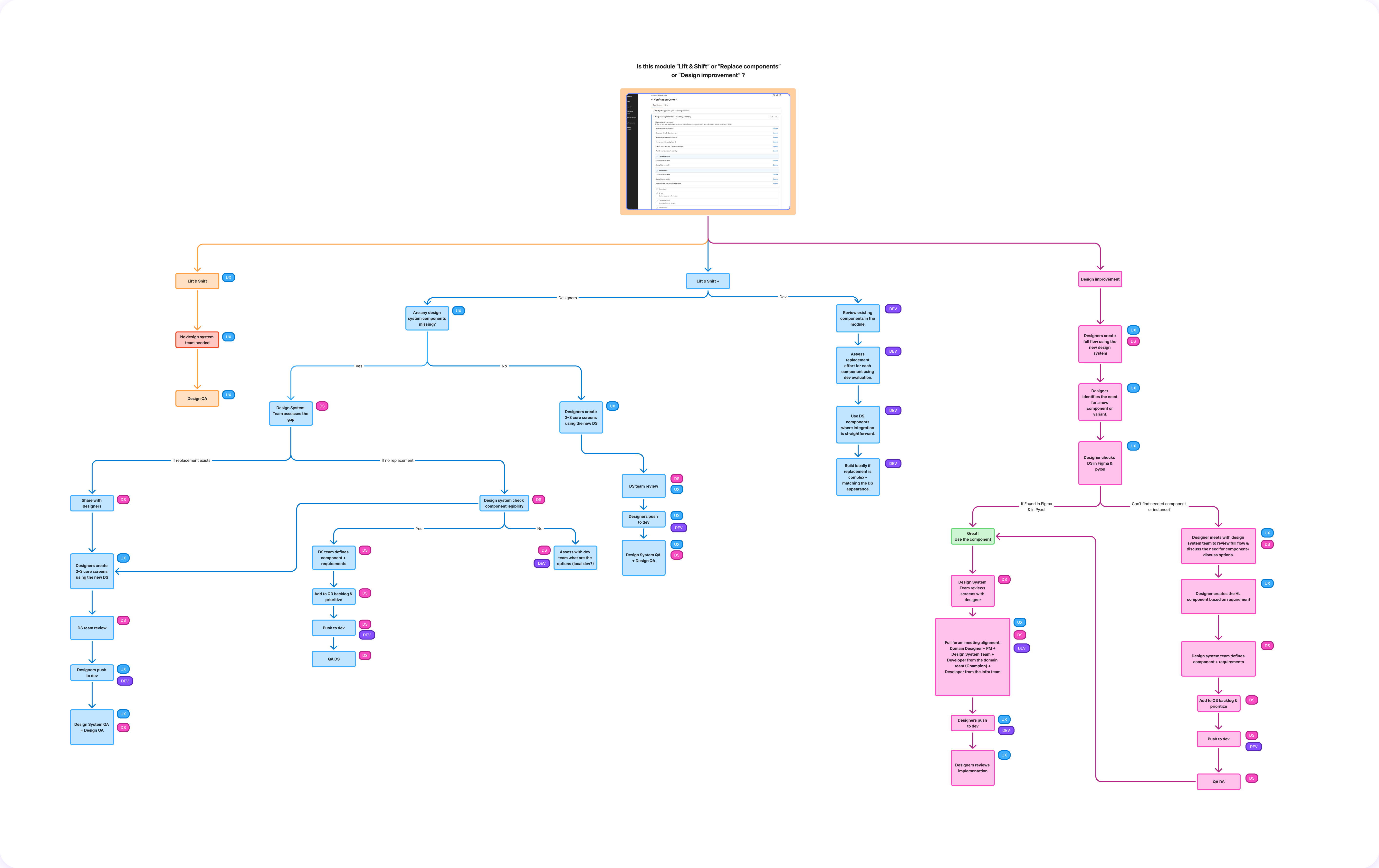
The gap path mattered most. The moment a designer could not find a component in Figma or in code, the workflow told them exactly what to do: the design system team assesses the gap, checks for an existing replacement, defines the component and its requirements, adds it to the quarterly backlog, and it is built and QA’d before the module ships. No local components, no detached instances, no “we’ll fix it after launch”.
The migration surfaced gaps faster than one team could fill them.
Every redesigned module found a component or variant the system did not yet have. Under the original model, each of those requests waited for the dedicated infra team: feasibility, breakdown, grooming, build, QA, one queue for the entire company. The queue became the critical path of the migration.
So we changed who builds. Product teams began contributing components directly, through a developer champion in each crew. The design system team kept what has to stay central: research, the first high-level design, the definition, the review and the approval. Contribution moved the hands; governance stayed put.
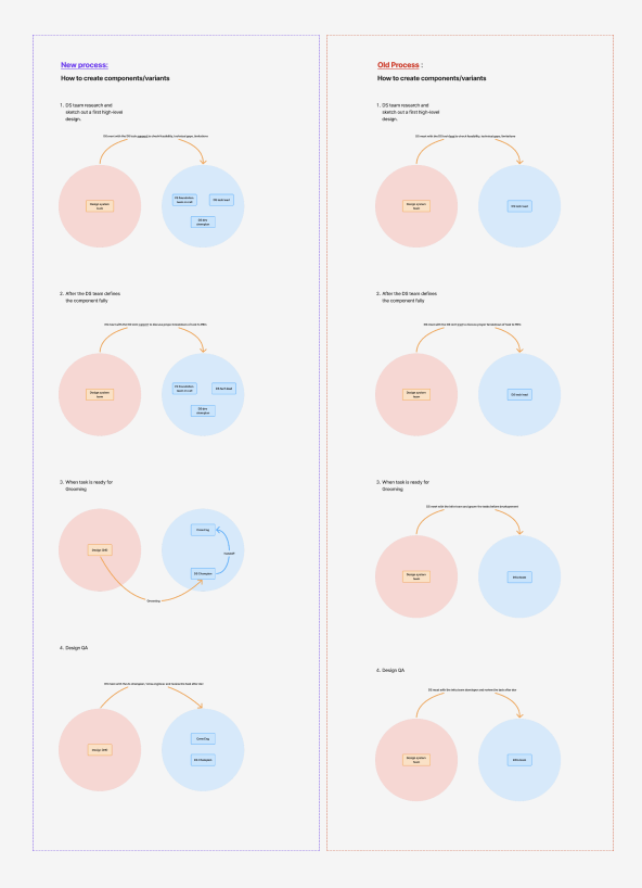
{{ c.body }}
Making it stick
A process only works if people can find it. Both the migration workflow and the contribution flow were written into the ways-of-working documentation, walked through with every domain team, and used as the reference in each grooming session. When a team asked “can we just build this locally?”, the answer was a link, not an argument.
One platform that behaves like one product, built by more than one team.
{{ o.title }}
{{ o.body }}
Two things I would carry into any similar program. First, attach the design migration to work engineering already has to do; consistency is rarely funded on its own, but it rides well on a refactor. Second, write the process down before you need it. With two designers and a whole platform, the workflow did more work than we did, and the contribution model is what kept the system healthy once the migration ended.