From selection pages to real destinations.
My first project after joining Payoneer as a Senior Product Designer, before moving to lead the design system. Every sidebar item opened a “selection page”: a grid of boxes where some were actions and some were pages, with nothing to tell them apart. I removed those pages and replaced them with dashboard navigation: six destinations that each open a real page with its own overview, tabs and actions.
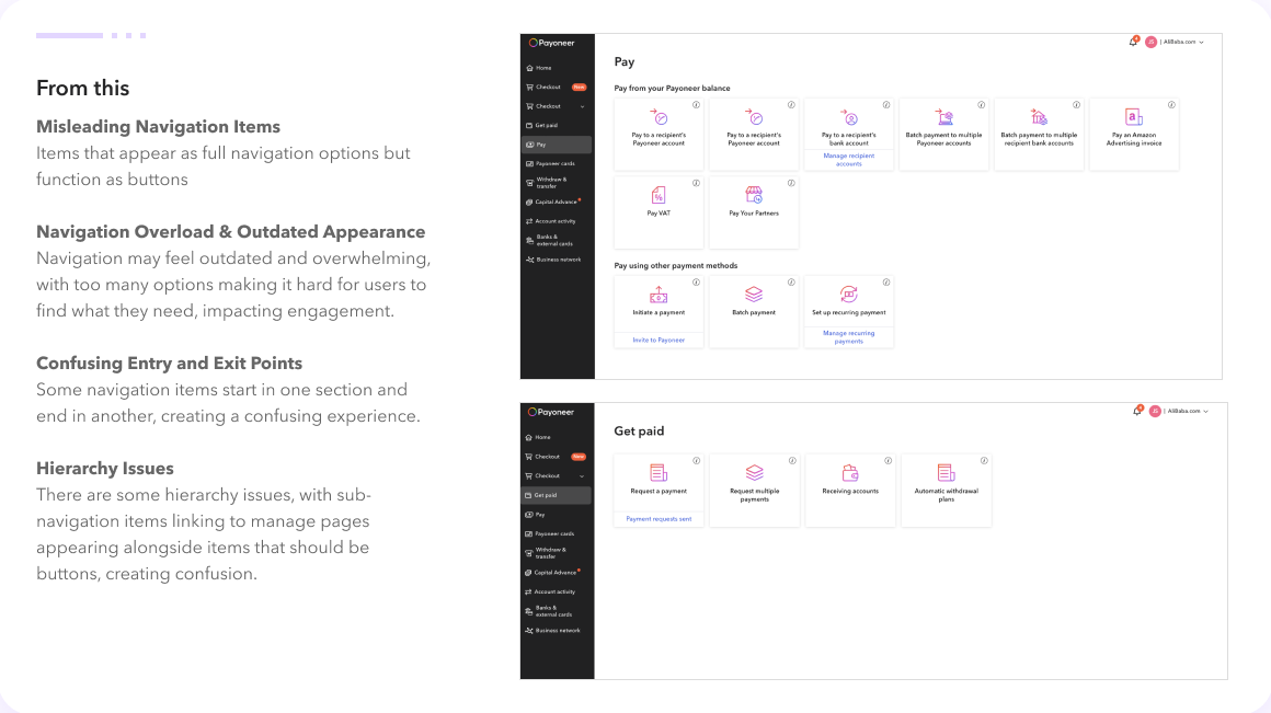
Every sidebar item led to a selection page: a grid of boxes where some started an action, some opened a page and some jumped to another section, all drawn the same way.
Audit every selection page and every box for what it really did. Separate destinations from actions. Explore nested navigation against dashboard navigation and commit to the one that removed the selection pages entirely.
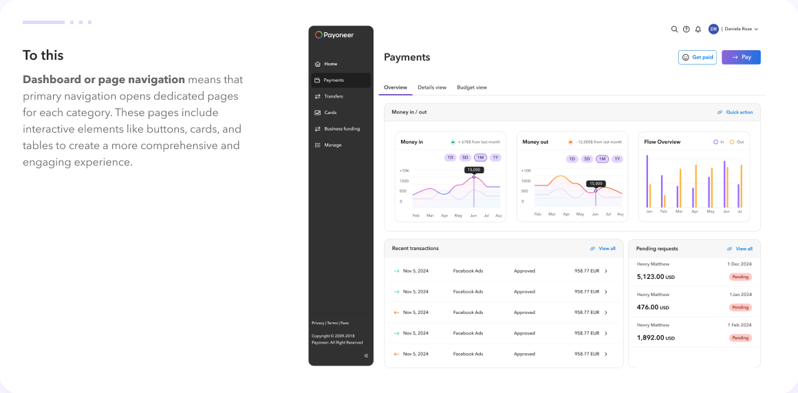
Selection pages are gone. Each sidebar item opens a dashboard page with an overview, tabs and its primary actions as buttons. Every page is built on the design system.
Every click in the sidebar landed on a page of boxes.
Payoneer’s navigation had grown one feature at a time. Choosing Pay, Get paid or Withdraw & transfer in the sidebar did not take you to a page about paying, getting paid or transferring. It opened a selection page: a grid of boxes, each with an icon and a label, where the real product hid one click further. Some boxes started a wizard or a full-screen modal. Some opened a page. Some linked into a different section altogether. Nothing in their appearance said which.
Users had to read every label and guess. And because the selection pages carried no data, the platform told them nothing about the state of their business until they had committed to one of the boxes. Money in, money out, pending requests: all of it lived three levels down.
I clicked everything, and wrote down what actually happened.
Before proposing a new structure I audited the whole platform: every sidebar item, every selection page behind it, every box and sub-link inside those pages, and where each one ended up. The map was annotated with what the element looked like versus what it did. Four gaps accounted for almost all of the confusion.
{{ s.body }}
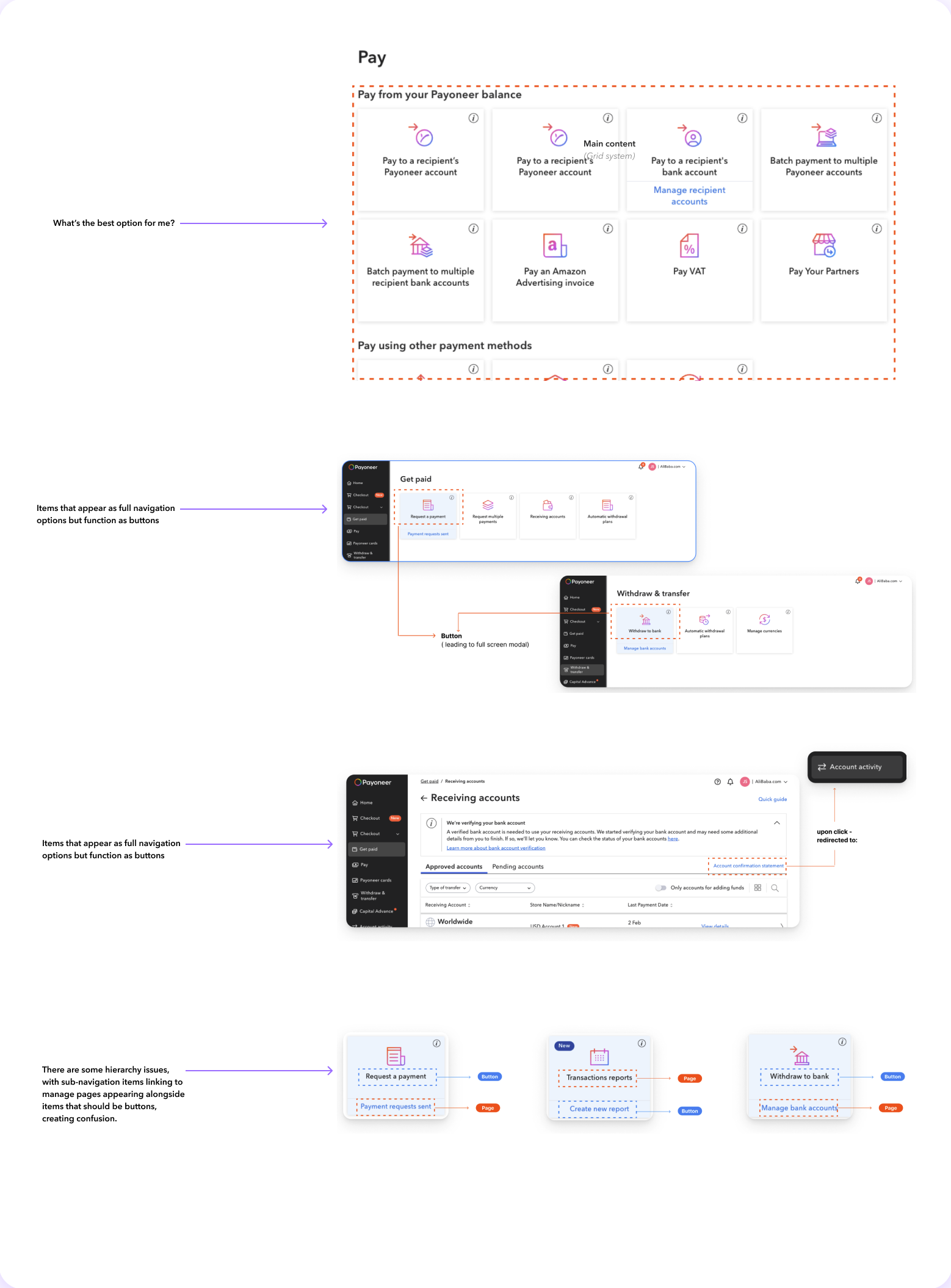
The finding underneath the four: the selection page itself was the problem. It existed so that pages, actions and sub-sections could all be listed at the same level, and nothing stopped a new feature from adding another box. Fixing navigation meant removing the selection pages, not tidying them.
Navigation takes you somewhere. Buttons do something. No page in between whose only job is to ask which.
Every box on every selection page was sorted.
A box either became part of a destination page (an overview widget, a tab, a row in Manage) or a button on the page where its task happens. Nothing kept its place as a box.
{{ f.body }}
Pages you land on, or menus you open?
Removing the selection pages left one question: what should a sidebar click do instead? I built two options with the new design system components and put both in front of product and the front-end guild.
{{ r.title }}
{{ r.body }}
{{ r.learned }}
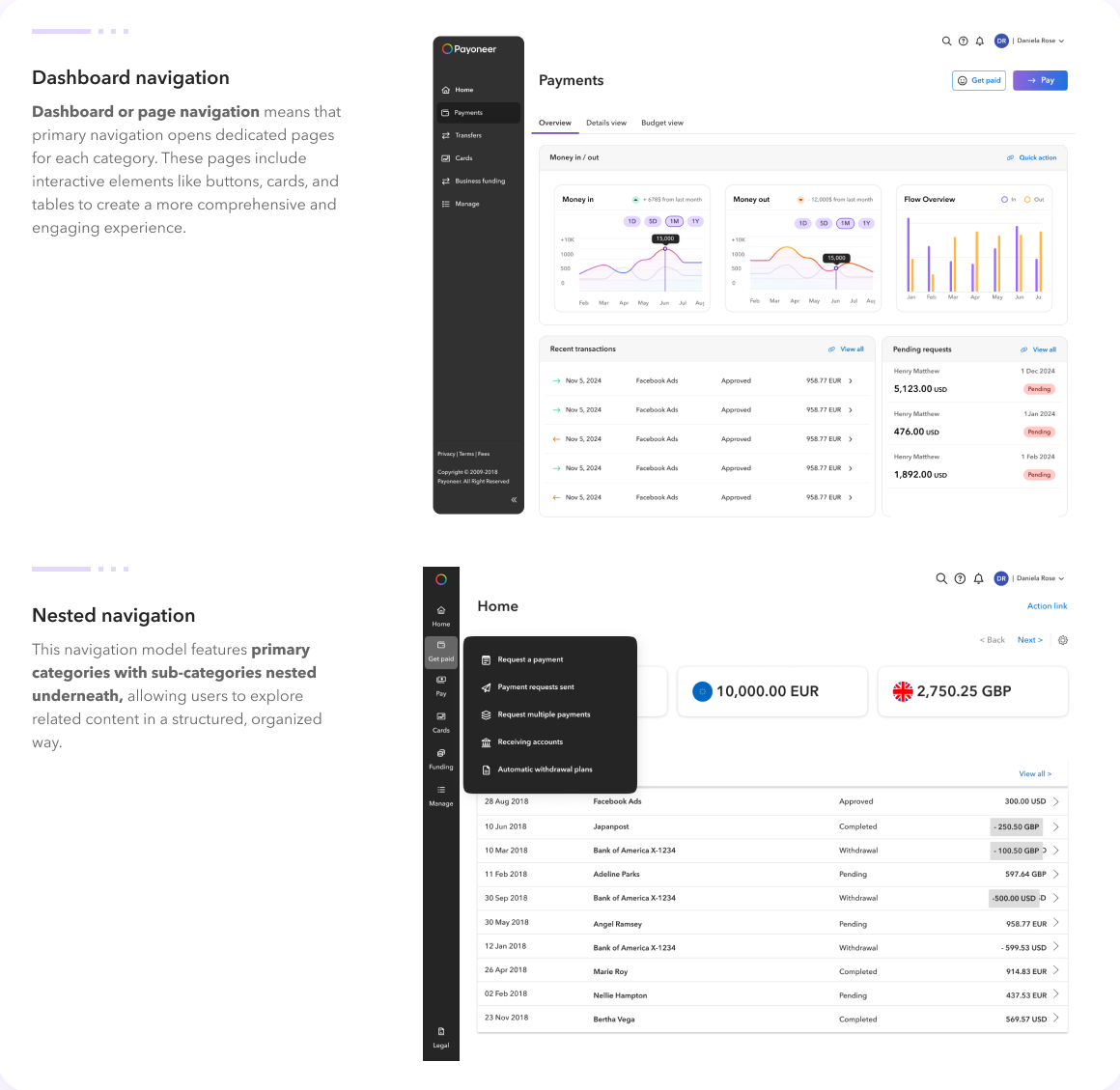
I recommended dashboard navigation, and it was chosen. Nested menus were compact, but they were the selection page in a smaller box: a list of labels with no context, where the user still had to guess. A dashboard page shows money in and out, recent activity and pending requests before anyone decides what to do next. It also gave each domain team a template to own, which became the base for the platform migration I led later from the design system team.
Selection pages out. Dashboard pages in, across the platform.
Each area of the platform was rebuilt on one template: a page title, the one or two primary actions as buttons top right, tabs for views within the destination, and content that shows state before it asks for input. The boxes that used to fill Pay and Get paid became overview widgets, tabs, or the two buttons that now appear wherever paying or getting paid makes sense.
{{ g.body }}
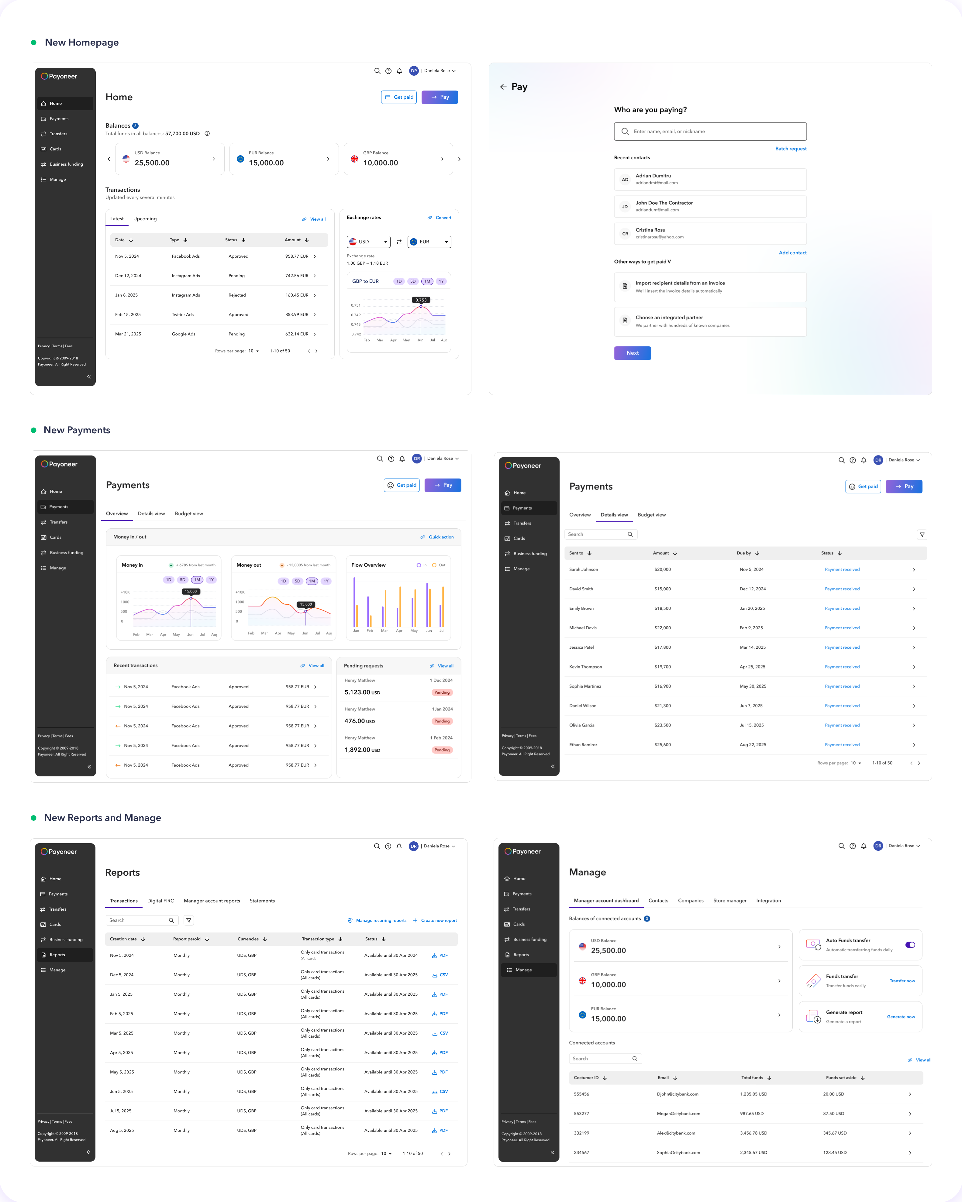
Fewer items, more information, and a rule that keeps it that way.
{{ o.title }}
{{ o.body }}
The audit took longer than the design. It was also the reason the design was accepted: every removed box had a documented reason and a new home, so the conversation with product teams was about where things go, not whether they matter. The navigation rule now lives in the design system, so the next feature launch has to argue its way into the sidebar rather than simply landing there. This project is also what led me into the design system team: the navigation exposed how much of the platform’s inconsistency was structural, not visual.