Making compliance work feel obvious.
An end-to-end redesign of an AI communications-compliance platform, from a fragmented, dense enterprise tool into a clear, consistent product, plus the design system it needed to keep scaling.
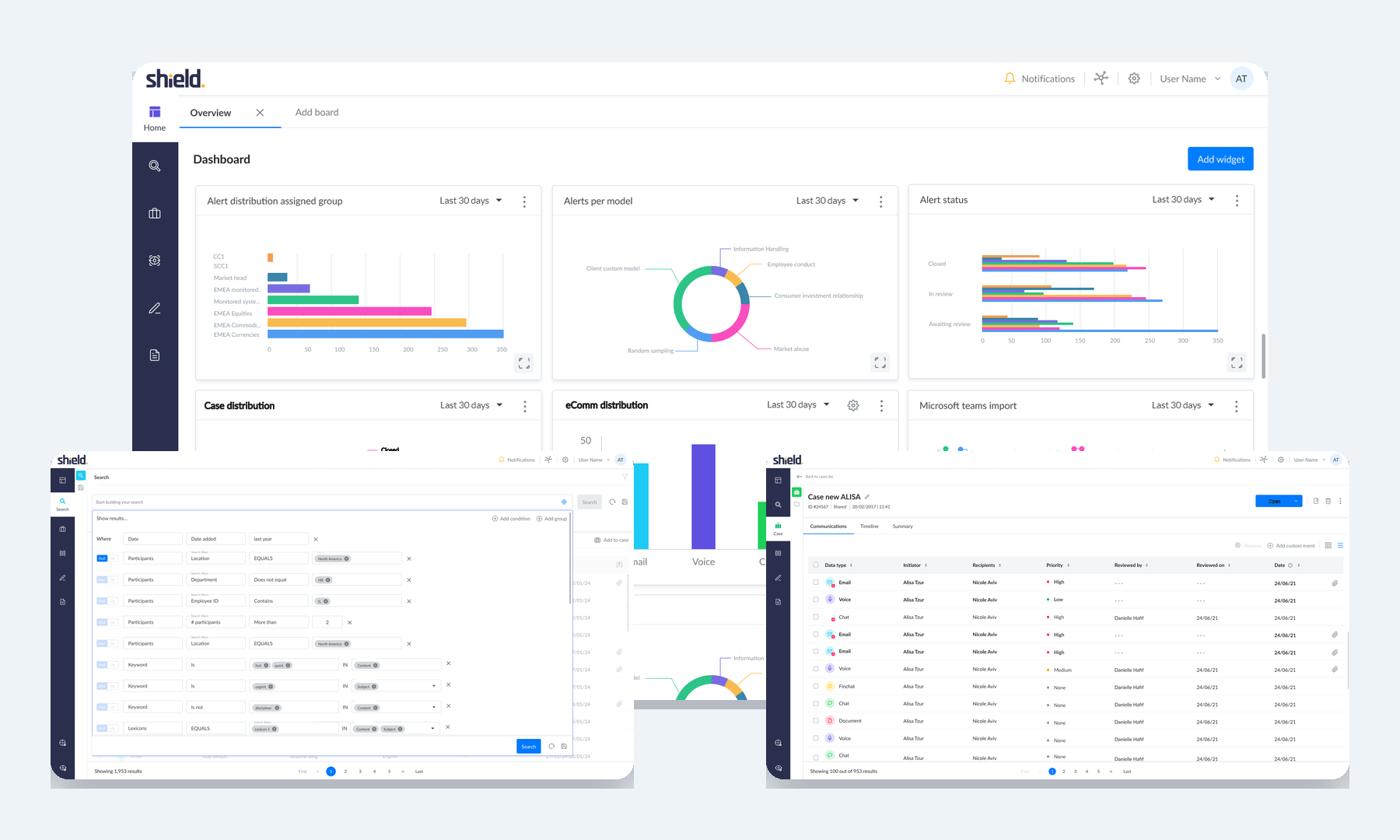
Fragmented navigation, dense screens, inconsistent patterns and a dated look made demanding compliance work harder than it had to be.
Audit, research, IA, personas, journeys, wireframes, visual direction, prototyping and testing, then a design system to hold it together.
A clearer platform structure, redesigned core workflows, and a reusable foundation that product and engineering build on.
A powerful product that had grown without a shared framework.
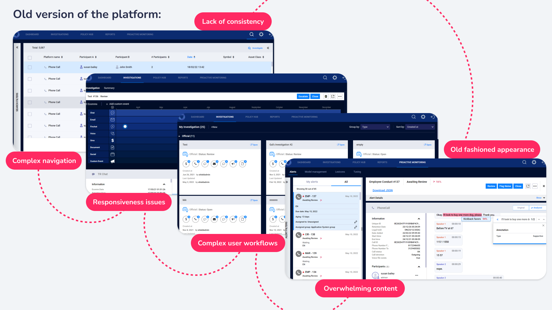
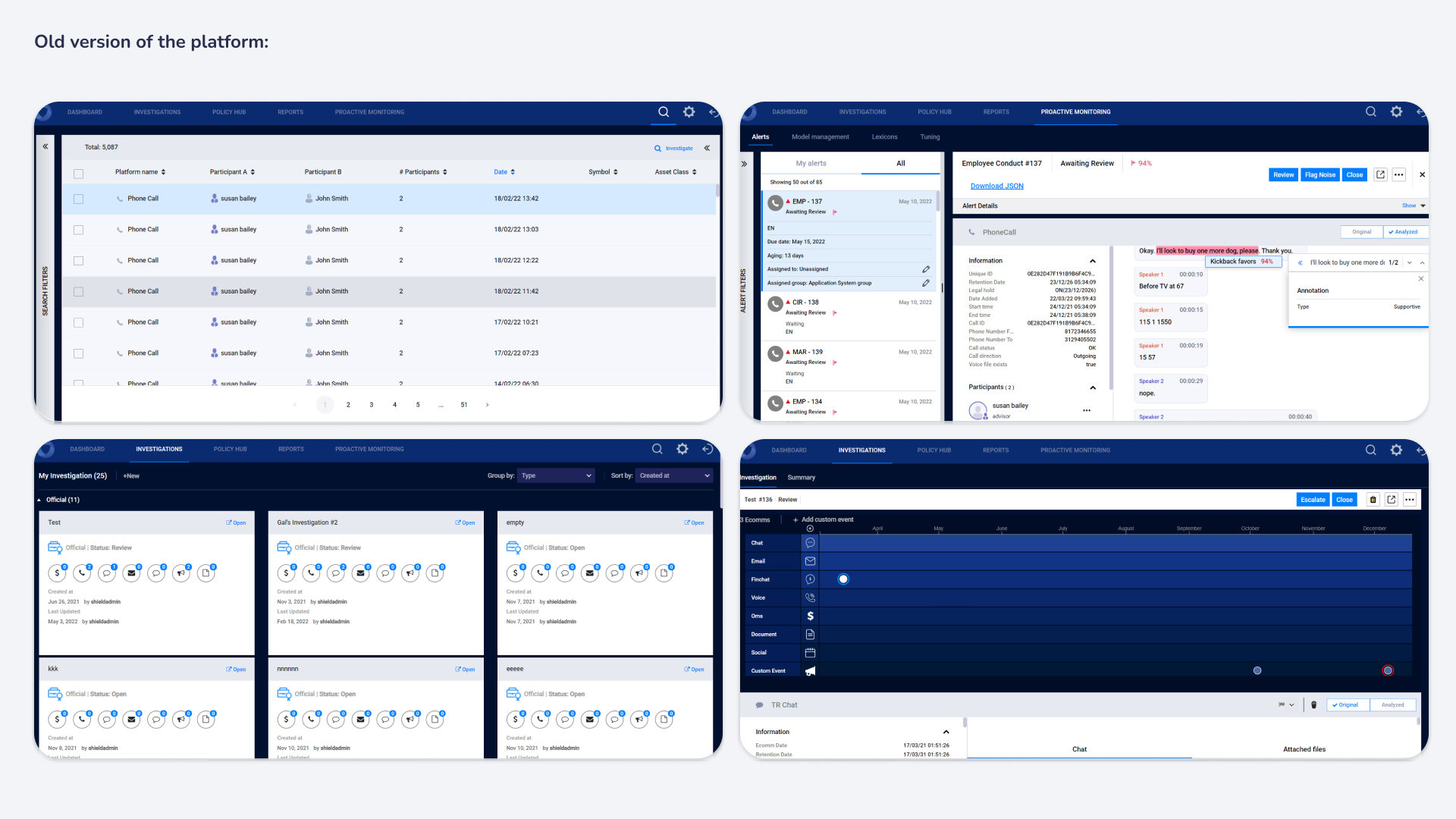
Compliance officers use Shield to investigate employee communications, monitor risk, build policies, manage cases and produce reports, under regulatory pressure. I started with a full review of functionality, navigation, consistency and usability, combined with feedback from users, prospects, sales, developers and solution architects. Similar actions behaved differently, navigation was hard to predict, density was overwhelming, and common tasks took too many steps.
Mapping the platform before changing it
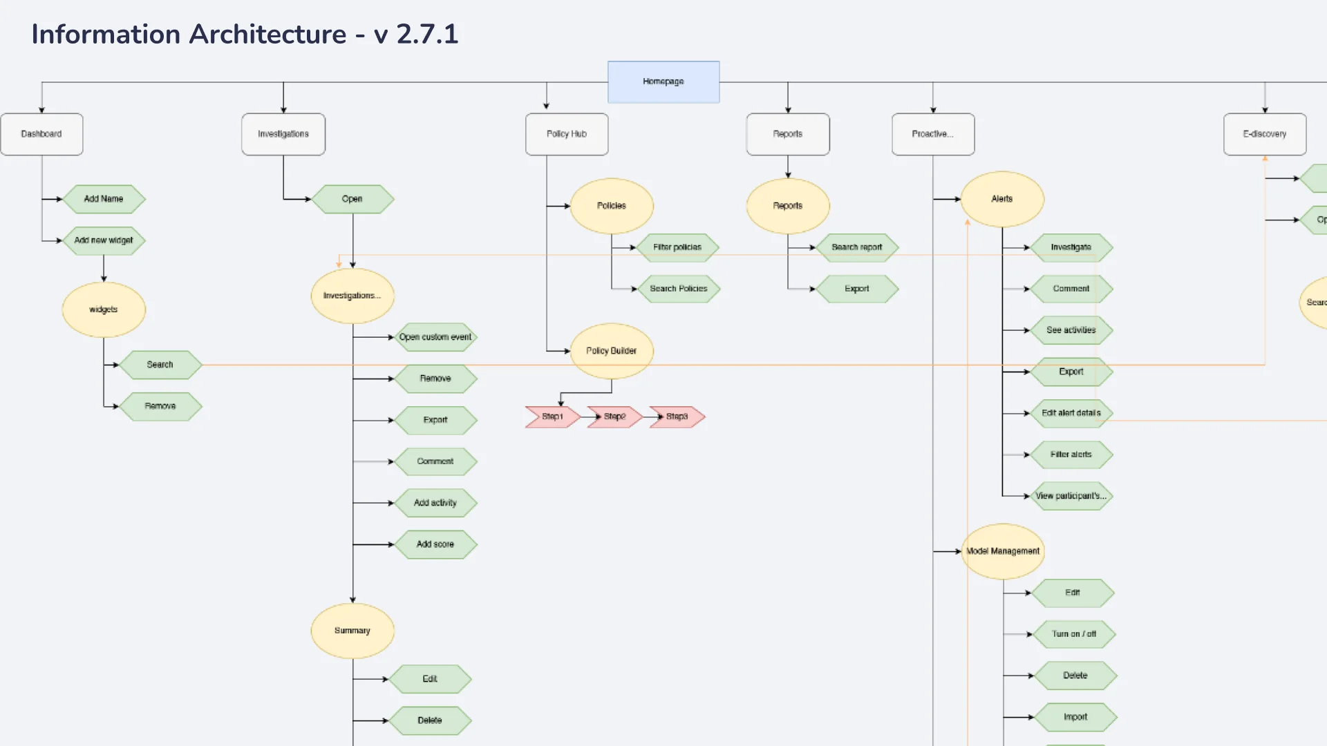
An information-architecture map of how features, screens and actions connected exposed duplicated routes, unclear hierarchy and places where the system’s structure didn’t match how users thought about their work. It became the shared reference for prioritising the redesign.
Internal knowledge, plus the reality of people who use it every day.
With the audit in hand, I spent the next weeks listening before designing. Three strands ran in parallel: what the company already knew, what users actually experienced, and a survey to test whether the two agreed.
{{ r.title }}
{{ r.body }}
What I heard
Across interviews and the survey, four themes came back regardless of role or seniority. They became the brief for the redesign and the yardstick every wireframe was later judged against.
{{ i.body }}
The evidence behind it
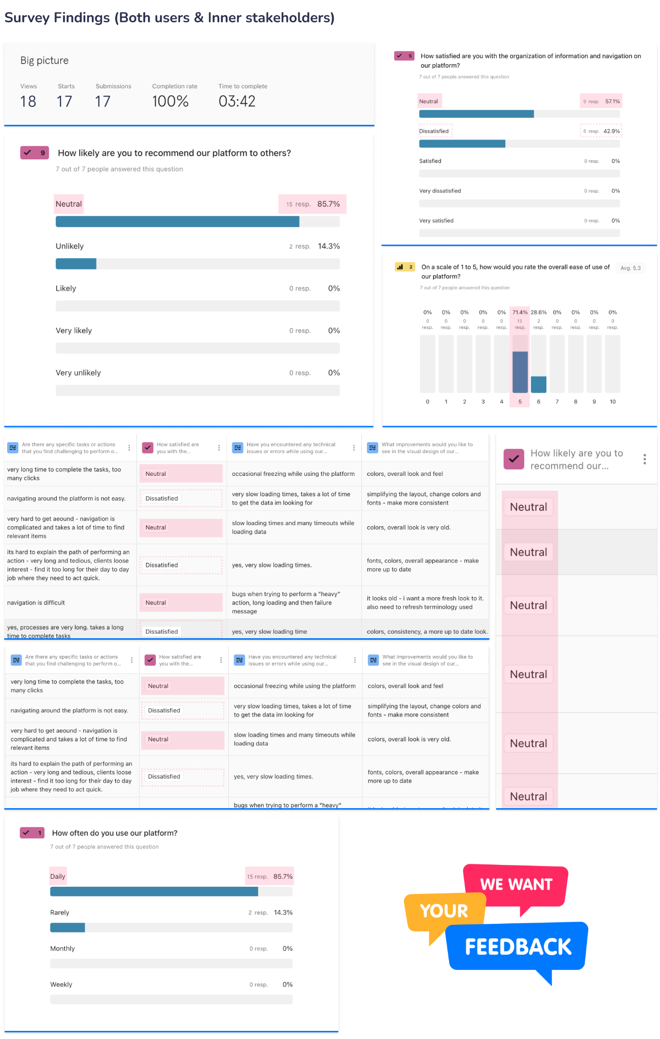
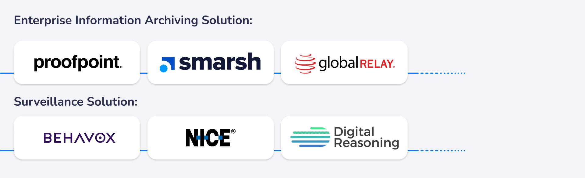
The survey put numbers on what the interviews suggested, and a look at the market explained why: competitors solved either archiving or surveillance, while Shield did both in one product. Breadth was the differentiator, and the interface had to make it feel simple.
Who it had to work for
The research resolved into two primary users on the same data with different goals, experience and tolerance for complexity. Every later decision on hierarchy, customisation and workflow was checked against both.
{{ p.name }}
{{ p.summary }}
- {{ n }}
- {{ n }}
Complex work was being made more complex by the interface.
Not one bad screen, but the combined effect of unclear navigation, overwhelming content, long workflows and inconsistent patterns across the whole product.
Redesign the experience and the system behind it.
Reorganise around clear tasks, simplify navigation and language, cut interaction cost, fix accessibility and responsiveness, and build a shared design system so it stays that way.
Personas → journeys → wireframes → UI and system.
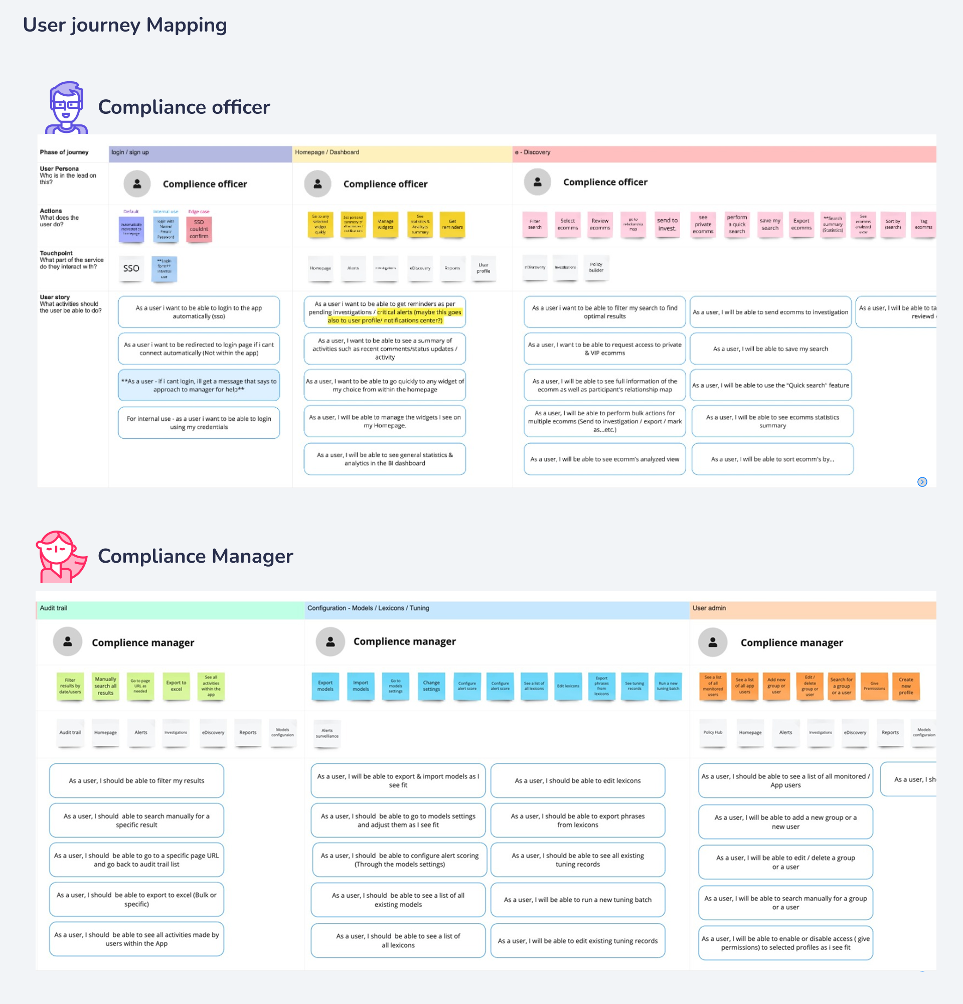
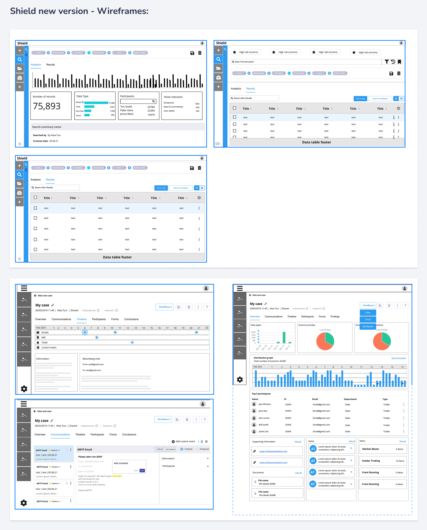
I mapped compliance officers’ and control-room managers’ journeys across database checks, alert monitoring, investigations, case creation, policy management and reporting. Seeing the whole service exposed friction, duplication and missing context before any screen was drawn. Wireframes then resolved navigation, hierarchy and flow, judged against the pain points, not taste.
Deciding the look and feel
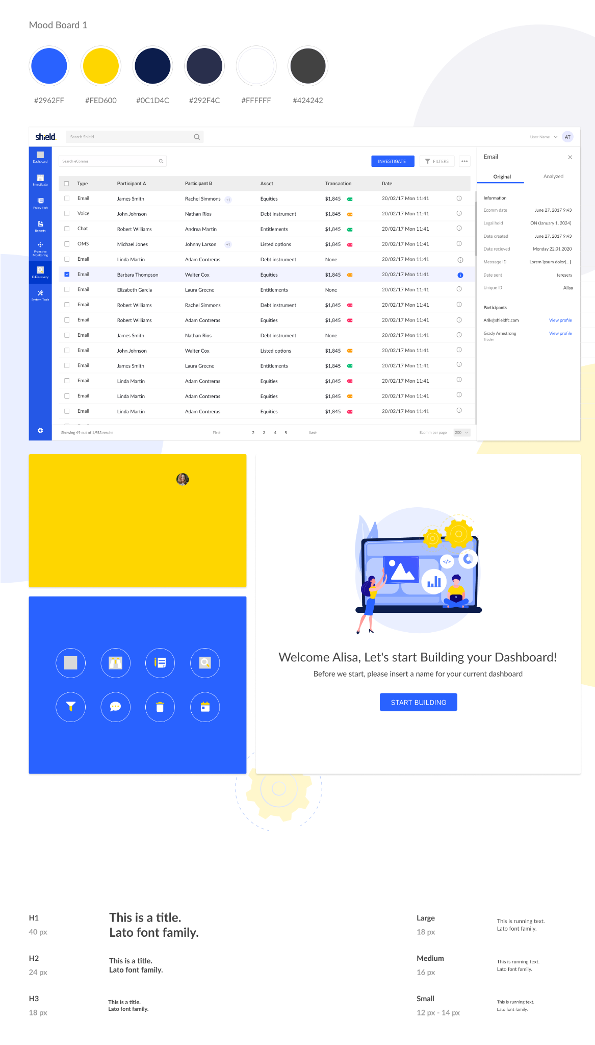
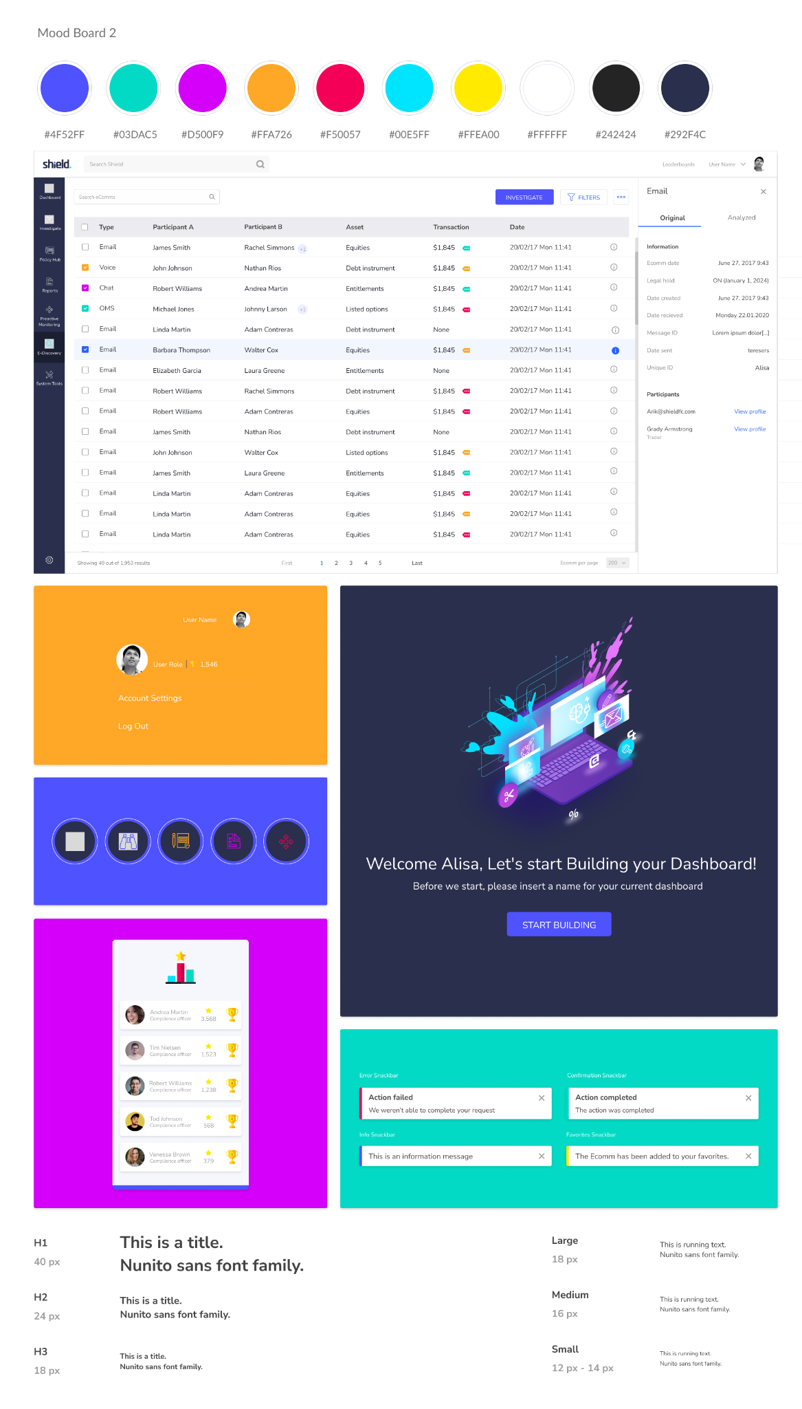
With wireframes approved, I ran the visual direction with the CEO, CTO, Head of Marketing and Head of Product. Mood boards made the options concrete (palette, type, imagery, tone) so the decision was about the product’s audience, not personal preference.
A design system underneath
As high-fidelity work took shape, shared styles and components became a proper design system: foundations, components, patterns and guidance, implemented with R&D in Storybook. The work shifted from redesigning screens to building what screens are made of.
One connected experience across monitoring, search, investigation and policy.
{{ g.title }}
{{ g.body }}
A product experience, and a foundation for what came next.
{{ o.title }}
{{ o.body }}
Redesigning a complex enterprise product isn’t a screen problem. It took diagnosis, research, organisational alignment, systems thinking and tight design–engineering collaboration to fix today’s usability and leave the platform stronger for what comes next.
Watch the project recap on LinkedIn ↗