From a library of screens to a decision system.
Rebuilding a mature fintech’s legacy UI library into a governed design system: clearer foundations, fewer and better components, and an operating model that lets design and engineering build the same thing.
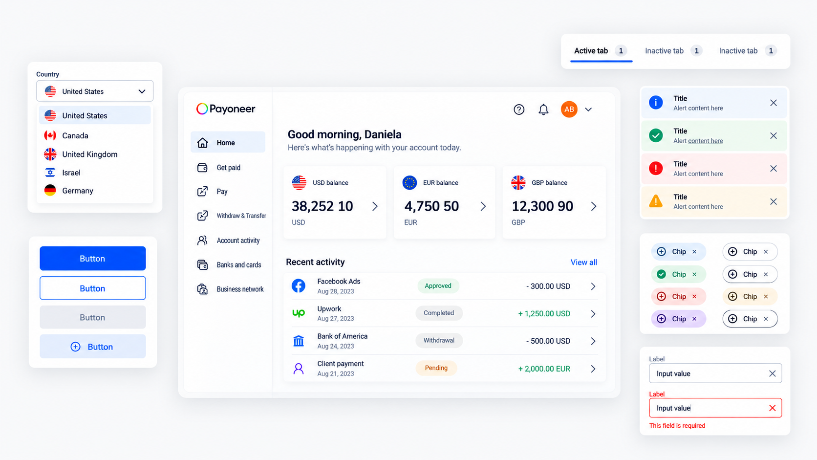
A library that captured years of UI but couldn’t tell you what was standard, current, accessible, responsive or built in code.
Treat the system as a product: audit the real material, separate rules from examples, rebuild foundations and masters, and put governance around it.
One shared language, fewer ambiguous choices, design and code that agree, and a system ready for navigation modernisation and new products.
The system behaved like an archive of possible UI, not a source of truth.
Payoneer runs high-stakes financial workflows across a mature ecosystem. Over the years the interface had collected legacy patterns, newer navigation models, local fixes and product-specific exceptions. As teams began modernising navigation, cards, account actions and verification flows, a system built on big visual boards and individual interpretation made reuse slow, and every new area likely to add another one-off.
{{ c.title }}
{{ c.body }}
Where we started
The original files held a great deal of useful work. The issue wasn’t a lack of examples, it was that examples had accumulated as boards of states, content combinations and screen-specific solutions, so designers had to interpret the system before they could use it.
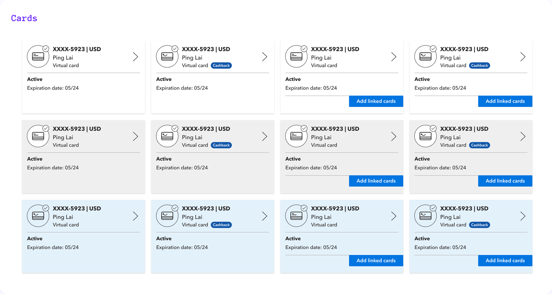
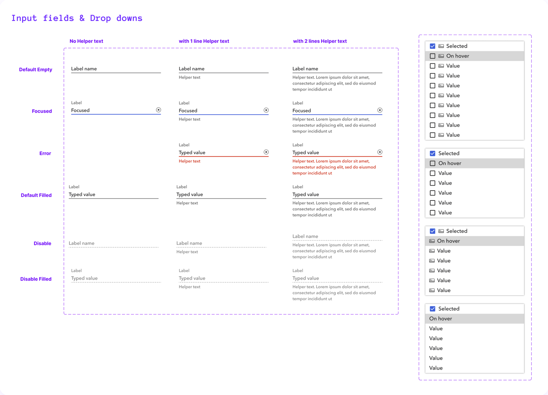
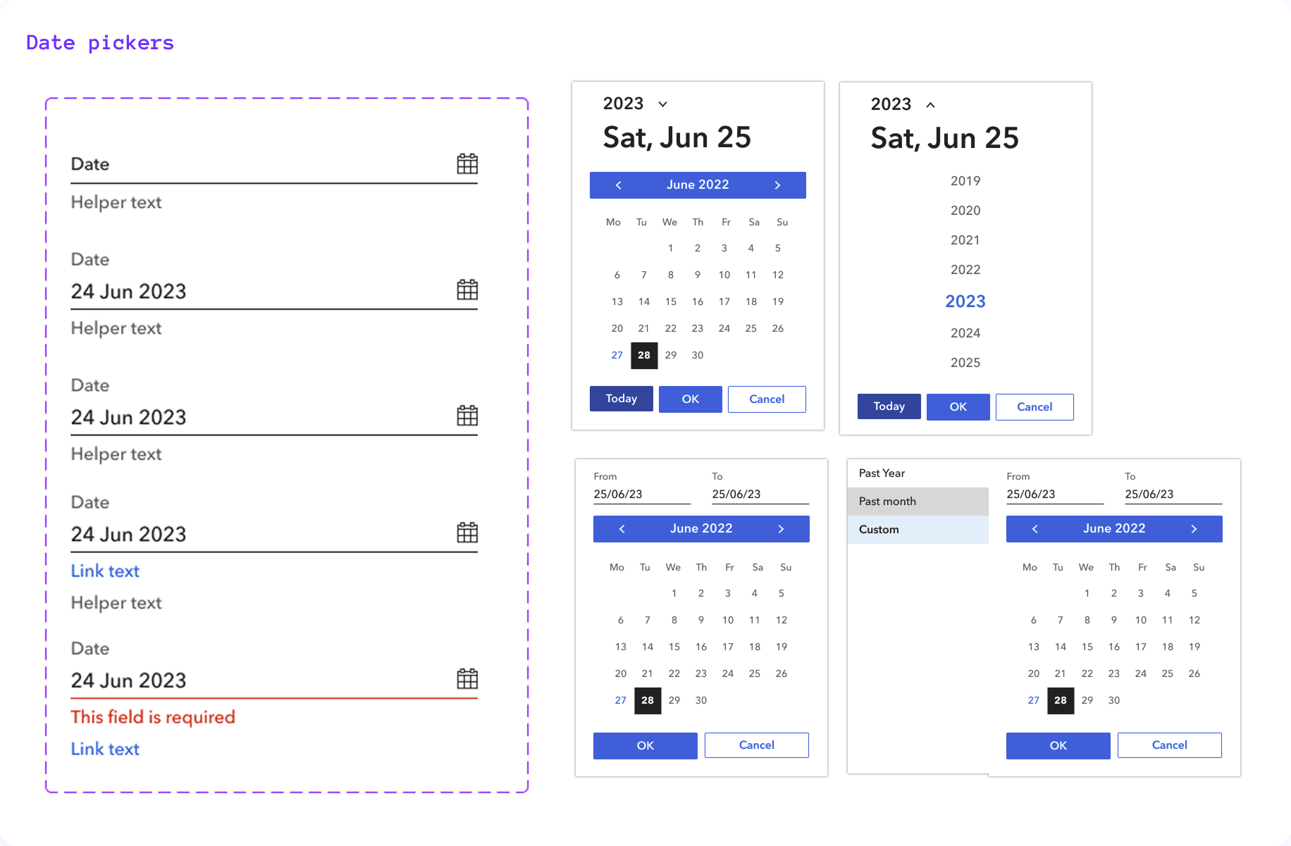
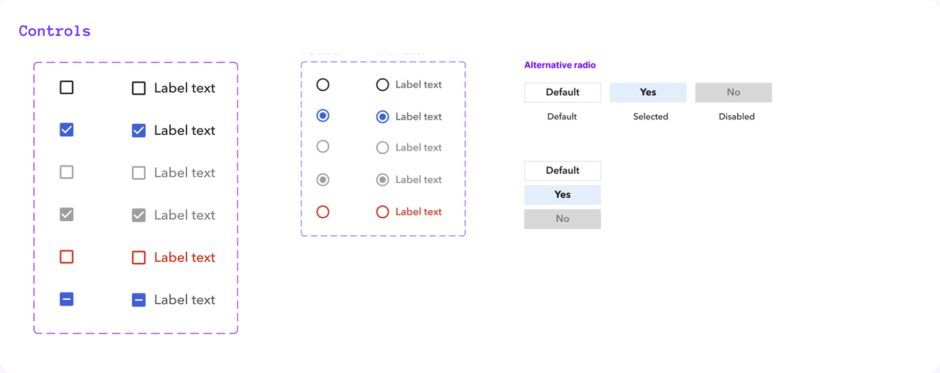
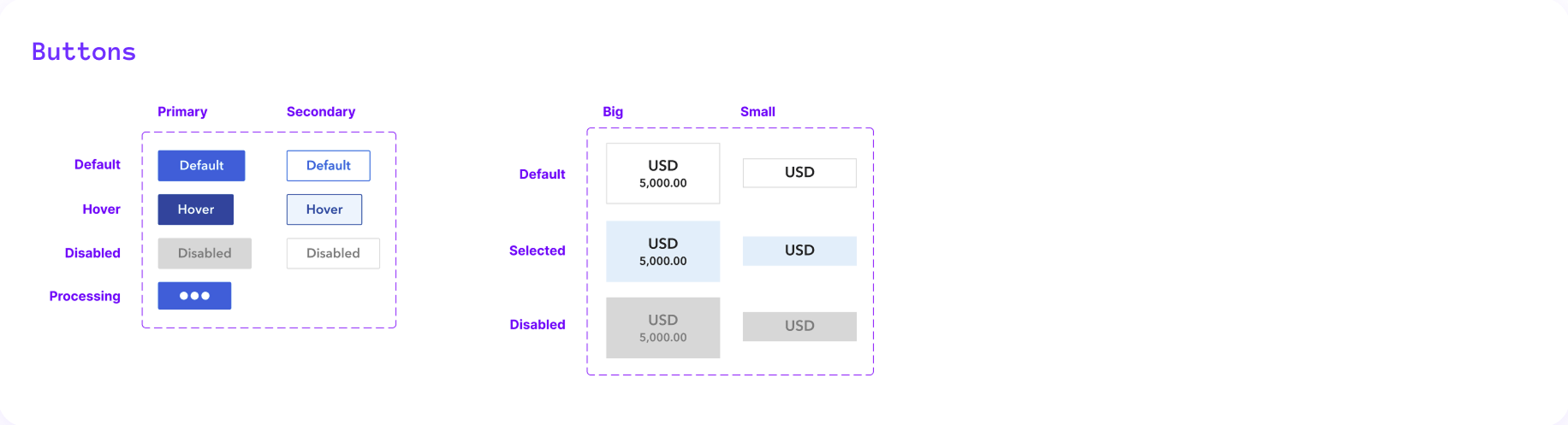
Finding the reusable system hidden inside the examples.
I didn’t need another inventory of screens. I reviewed repeated UI families side by side, traced how they appeared in live product flows, and separated stable behaviour from content variation and product exceptions. Four questions did most of the work:
{{ s.a }}
What it showed: visual examples were doing the job of documentation; state and content variation were mixed into the same matrices; and screen-specific solutions hid where reuse was possible. The library stored outcomes more clearly than it stored rules.
In product context
Component ambiguity surfaced as workflow complexity. Freezing a linked card meant a large management modal, an overflow menu, a destructive confirmation, then back to the list with updated status, four steps, four separate interpretations of hierarchy, overlays and feedback.
Decide how the system makes decisions before deciding how it looks.
{{ p.title }}
{{ p.body }}
Every request runs the same four gates.
So the system stops collecting exceptions, and design and engineering share one basis for yes, no, or not yet.
{{ f.body }}
Separate foundational decisions from the components that consume them.
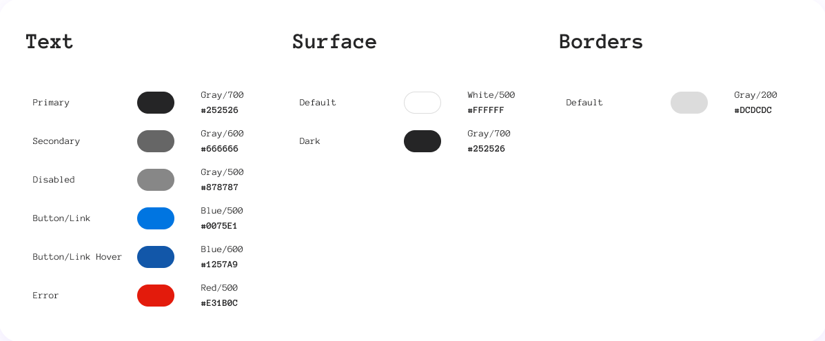
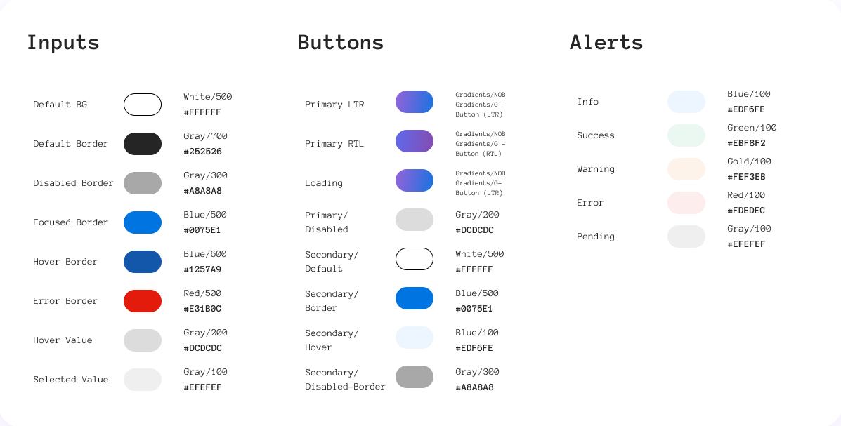
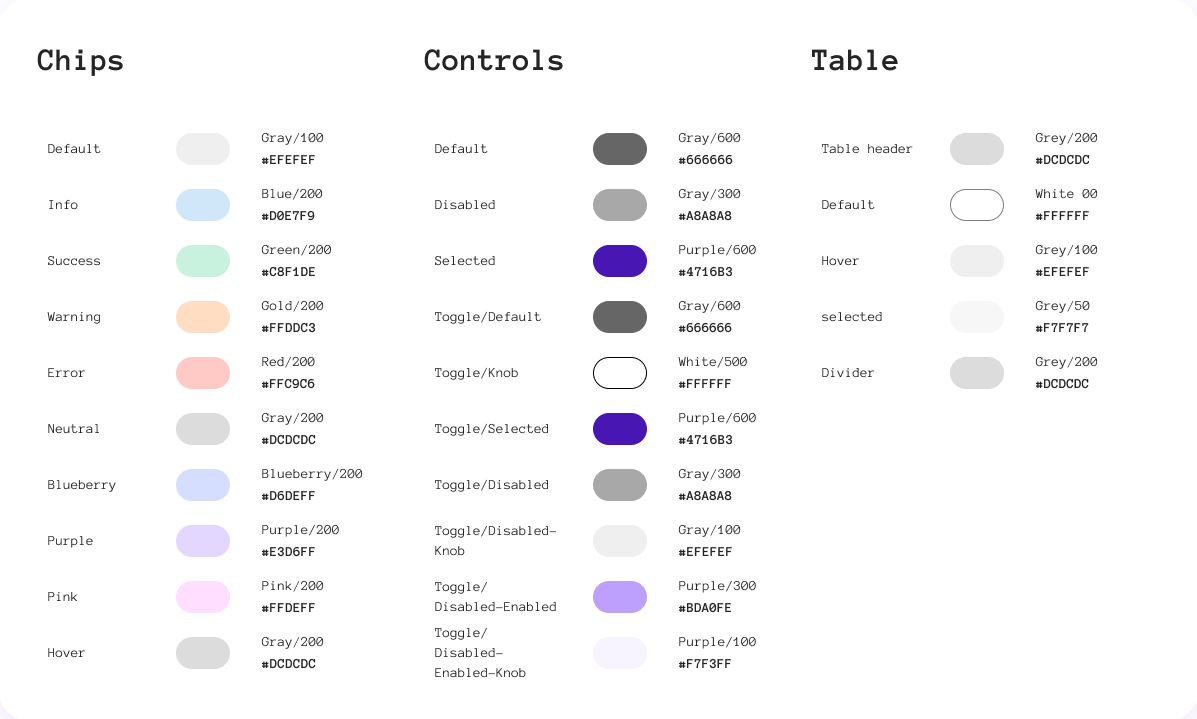
In the old boards, values lived inside component pages, so global change was hard and local overrides were easy. The new foundation connects primitives → semantic tokens → component tokens → themes, for colour, type, spacing, layout, responsive behaviour, icons and illustration. Components inherit changes instead of being rebuilt one by one.
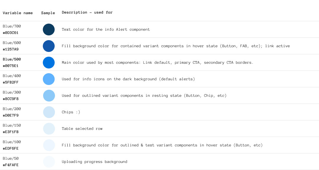
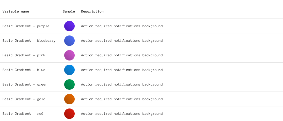
From primitives to meaning
Semantic tokens map primitives to roles, text, surface, border, and component tokens map those roles onto inputs, buttons, alerts, chips, controls and tables. A designer picks Text / Secondary, not Gray/600; when the scale shifts, every component follows.
Layout grid
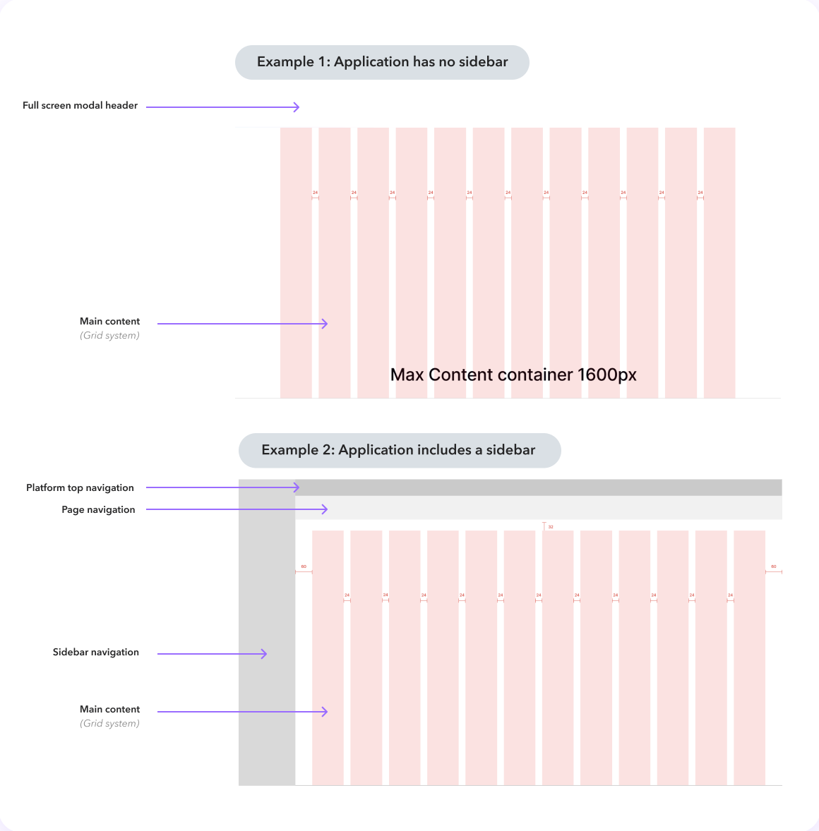
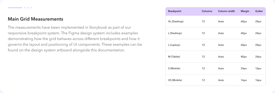
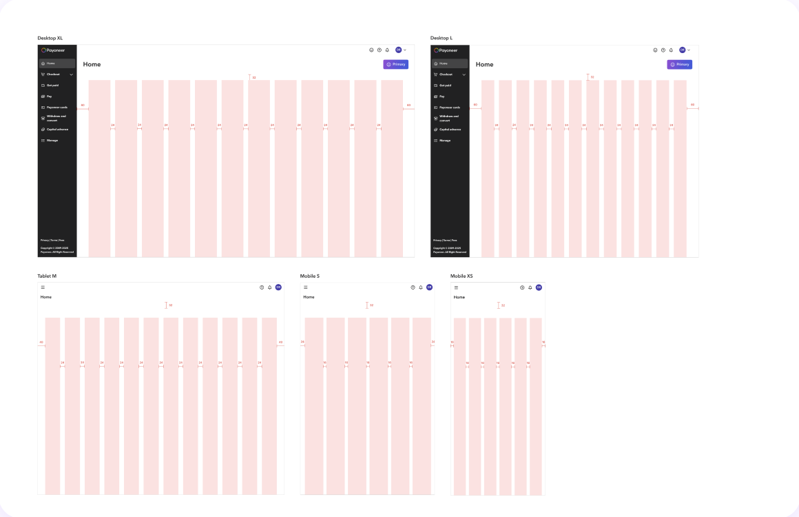
The legacy library had no shared grid, so every domain set its own page width, margins and column rhythm, one of the reasons hybrid screens looked so obviously stitched together. The new system defines one 12-column grid with a 1600px maximum content container, two page shells (with and without the sidebar), and six breakpoints from desktop XL to mobile XS. Columns stay at twelve everywhere; only margins and gutters step down. The same values are implemented in Storybook, so a designer’s 60px margin is the developer’s 60px margin.
Fewer choices, each one better.
Exhaustive matrices had let component APIs grow around page-specific needs. Master components replaced them: a stable anatomy, a deliberate property set and clear extension points, so product teams cover real cases without detaching instances or spinning up a local component per screen. Every master ships state-complete, hover, focus, loading, error, disabled, RTL, named to match code.
Building a master, step by step
Two recordings from the Figma file show how a master is structured, anatomy, properties, slots and states, so the library is legible to whoever opens it next.
A system needs a lifecycle, not only a library.
The old artifacts never said whether a component was proposed, approved, implemented, legacy or deprecated, so teams copied, modified locally, and created another source of truth. Now every component has an owner, a status and a route for change, and the system runs on a backlog, grooming and planning like any product.
{{ g.body }}
Adoption: let the friction make the case
Designers adopted first, the system shipped as Figma libraries, so shared tokens and components entered their daily work with no extra step. Product teams were harder. Engineers kept receiving designs built from components that didn’t exist yet in their codebase, and the gap between design and code became visible in every sprint.
We didn’t smooth that friction over; we used it. Each mismatch was evidence that features would ship faster once the system was in the team’s stack, and, one by one, teams came to the same conclusion. Rollout was then prioritised around high-frequency components and live initiatives, with workshops, office hours, pairing and migration maps behind it.
From a dedicated build team to a contribution model
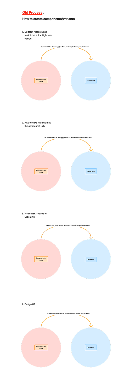
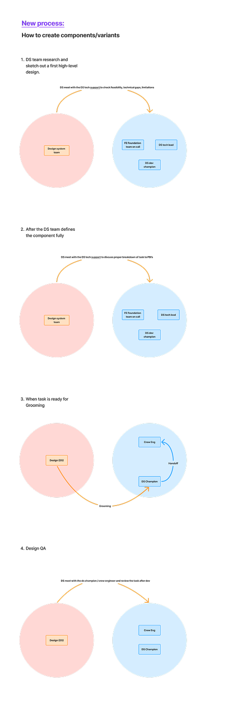
For the first phase, a dedicated infra team built the system in code. It gave us control and consistency while the foundations and the bulk of the library were being established. Once the library reached roughly 95% component readiness, the bottleneck moved: teams were now waiting on one small group for every new component or variant they needed.
So we changed the operating model. Product teams began contributing directly, more hands, shorter waits, and components built by the people who needed them. Governance did not move with it: the design system team still defines, reviews and approves every component, so nothing enters the system unsupervised. The contribution flow is written into our ways-of-working documentation and is the reference in every conversation with product teams.
{{ c.body }}
Measure clarity, adoption, quality and delivery, not the size of the library.
{{ o.title }}
{{ o.body }}
The screenshots suggested a component cleanup. The real redesign was organisational: how decisions were stored, communicated, implemented and maintained. The leadership job was to keep the valuable legacy knowledge while removing the accidental complexity, prioritisation, cross-functional agreement, migration planning, and an operating model that keeps the system healthy after release.